
Understanding data
As an example, imagine that three students each took snow depth readings in their front yards on four days. Alice, the first student, got measurements of 3 cm on the first day, 6 cm on the second day, 10 cm on the third day, and 7 cm on the forth day. Jane got measurements of 5 cm on the first day, 4 cm on the second day, 7 cm on the third day, and 6 cm on the fourth day. Mark got 2 cm on the first day, 3 cm on the second day, 6 cm on the third day, and 8 cm on the fourth day. cm is an abbreviation for centimeters. Since this isn't very much data, you can answer some questions about it by reading it again:
 On what day did Jane have her maximum snow depth?
Which student had the least snow on the first day?
What was the minimum amount of snow that Alice got?
It might be easier for us to understand the data that Alice, Jane, and Mark collected if we didn't have to read so much just to find the answers to those questions! One way that we can make our data easier to understand is by putting it in a table. A table is a bunch of rows of boxes. You put your data in the boxes to organize it. Here's what our data would look like in a table:
Snow measurements in centimeters for three students
| Student | day 1 | day 2 | day 3 | day 4 |
| Alice | 3 | 6 | 10 | 7 |
| Jane | 5 | 4 | 7 | 6 |
| Mark | 2 | 3 | 6 | 8 |
Now let's try to answer those same questions again, this time using our table to find the information we need.
On what day did Jane have her maximum snow depth? Instead of having to read a whole paragraph, now we read the row of data on the same line as Jane's name and look for the biggest number. Jane's data is blue. Seven cm is Jane's maximum snow depth. The table says "day 3" at the top, above the seven, so we know that Jane got her maximum snow depth on day three.
Which student had the least snow on the first day? We look at the data under "day 1" and see that Alice got 3 cm, Jane got 5 cm, and Mark got 2 cm. So Mark had the least snow on the first day.
What is the minimum amount of snow that Alice got? When we look at the row of data for Alice, we see that the smallest number is three. The minimum amount of snow Alice got was 3 cm.
A table is a lot easier to understand than a big list of data. Can you think of another way we could show our data, where people could learn something from our data without even reading the numbers? How about a bar graph? A bar graph is a way of showing data with colored bars. Big numbers in the data are represented by big bars, and small numbers in the data are represented by small bars. Here's what our data would look like in a bar graph:
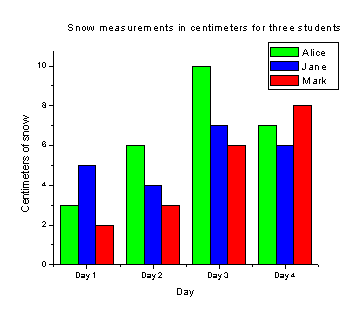
Now let's try to answer those same questions again, this time using our bar graph to find the information we need.
On what day did Jane have her maximum snow depth? To answer this question, first we need to look at the key for the bar graph. The key is the box at the top right hand corner of the graph. It shows that Alice's data is represented by green bars, Jane's data is represented by blue bars, and Mark's data is represented by red bars. Since we want to know about Jane's data, we look at the blue bars. Which of the blue bars is biggest? The biggest blue bar is over "Day 3," so Jane had her maximum snow depth on Day 3.
Which student had the least snow on the first day? Since we're interested in Day 1 for this question, look at the first three bars, over the words "Day 1." The first green bar shows how much snow Alice got on day one. The blue bar next to it shows how much snow Jane got on day one. The red bar next to that shows how much snow Mark got on day one. Which of these three bars is the smallest? The red bar is the smallest bar over "Day one." Since the red bars represent Mark's data, Mark had the least snow on the first day.
What is the minimum amount of snow that Alice got? Since we're interested in Alice's data, we look at the green bars. Which green bar is smallest? The first green bar is the smallest. We use the numbers on the left side of the graph to see how tall the green bar is. Since the small green bar comes up to the line between 2 and 4, the minimum amount of snow Alice got was 3 cm.
A bar graph makes it easier to compare data, because all you have to do is compare the size of the bars. But what if we had thousands of numbers in our data? It would be very hard to answer questions about the thousands of numbers if they were in a long list. Even if the data were organized in a table, it would still take a long time to find a maximum or a minimum. And a bar graph with a thousand bars would be very confusing! So we need to think of a new way to organize our data. How about a line graph? A line graph is a way of showing data using little points connected by lines. Here's what our data would look like in a line graph:
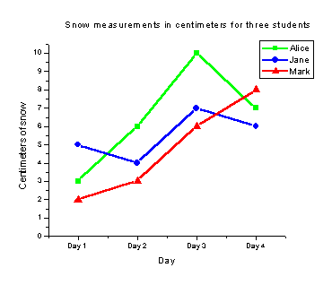
Now let's try to answer those same questions, this time using the line graph to find the information we need.
On what day did Jane have her maximum snow depth? First, we need to look at the key for our line graph to answer this question. The key shows us that Jane's data is represented by blue circles connected by blue lines. On what day does the blue line have the highest blue circle? The highest blue circle is for day three, so Jane had her maximum snow depth on day three.
Which student had the least snow on the first day? There are three symbols over "Day 1," a circle, a square, and a triangle. Which one is lowest? The triangle is lowest. Since Mark's data is represented by red triangles connected by red lines, Mark had the least snow on the first day.
What is the minimum amount of snow that Alice got? Since Alice's data is represented by green squares connected by green lines, we look to see what the lowest square is. The lowest square is for day 1. The numbers on the left side of the graph show us that the lowest square is at three centimeters, so the minimum amount of snow Alice got was 3 cm.
A line graph makes it easy to see when data is increasing (getting bigger) or decreasing (getting smaller). It also helps us understand where maximums and minimums are, without us ever having to read the original list of data!